-
About
Our Story
back- Our Mission
- Our Leadership
- Accessibility
- Careers
- Diversity, Equity, Inclusion
- Learning Science
- Sustainability
Our Solutions
back
-
Community
Community
back- Newsroom
- Discussions
- Webinars on Demand
- Digital Community
- The Institute at Macmillan Learning
- English Community
- Psychology Community
- History Community
- Communication Community
- College Success Community
- Economics Community
- Institutional Solutions Community
- Nutrition Community
- Lab Solutions Community
- STEM Community
- Newsroom
- Macmillan Community
- :
- English Community
- :
- Bits Blog
- :
- Revising for a More Visual Syllabus: The Schedule
Revising for a More Visual Syllabus: The Schedule
- Subscribe to RSS Feed
- Mark as New
- Mark as Read
- Bookmark
- Subscribe
- Printer Friendly Page
- Report Inappropriate Content
This summer I am revising some course documents to make my syllabus more engaging. So far, I have rethought how I show the grade distribution, (see: Converting to a More Visual Syllabus) and last week, I demonstrated how I am redesigning the list of required resources. Today, I am taking on the course schedule.
I usually arrange the schedule in a table, with a column for the class session date and another for the readings and work due that day. Above the table, I include the standard warning that the information is tentative and subject to change. It’s essentially the same arrangement that I have used since I began teaching.
It isn’t an ideal system because the schedule always changes. I have never managed to design a perfect schedule. Student needs sometimes lead me to allow more time for an activity or to add some extra readings. I may get sick and have to cancel a session. The university may cancel classes for a snow day. Something can and always does happen, and I end up having to revise the schedule completely.
I’m also skeptical that students use the schedule information. They see the information on the first day, but few return on a regular basis to track what we are doing. The various due dates and assignments are all available on the course website and on a calendar in our course management system, so there is no reason to return to the syllabus for the details.
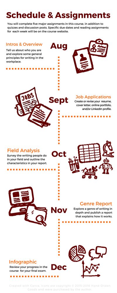
Still, I like to include basic scheduling information on the syllabus so that students can see the overarching plan for the course and get a feel for the work that they will be doing. I decided to focus on the specific information that I wanted students to know from the beginning of the course and remove all the other extraneous information. That decision freed up a lot of space, so I was able to redesign the schedule as a timeline that marks the major activities.
Here is the mockup that I have designed with Canva, a web-based graphic design program. Click on the image below to see an enlarged version of the mockup:
I like this timeline version so much more than the original table version. The icons that I use on the schedule are also used on the assignments themselves, to visually connect the schedule across the course documents.
The challenge of this version, however, is that as it stands, this mockup is not accessible for everyone. Since the text is part of a graphic, I would have to either duplicate the information on the page in a long description or add a separate long description webpage with the information. Ideally, I will redo the timeline in HTML5 code with accessible features. Fortunately, Karl Stolley’s Sweetland Digital Rhetoric Collaborative posts on Image Accessibility, Part I: Beyond alt Attributes and Image Accessibility, Part II: Beyond src Attributes tell me exactly what I need to do to improve the revision.
There is more work to do, but I am happy with the progress so far. What do you think? Would a timeline of the major projects work for your course syllabus? I would love to hear your thoughts, so please leave me a comment below. I look forward to hearing from you.
[Icons are copyright © 2015–2016 Hand-Drawn Goods and were purchased by the author.]
You must be a registered user to add a comment. If you've already registered, sign in. Otherwise, register and sign in.


